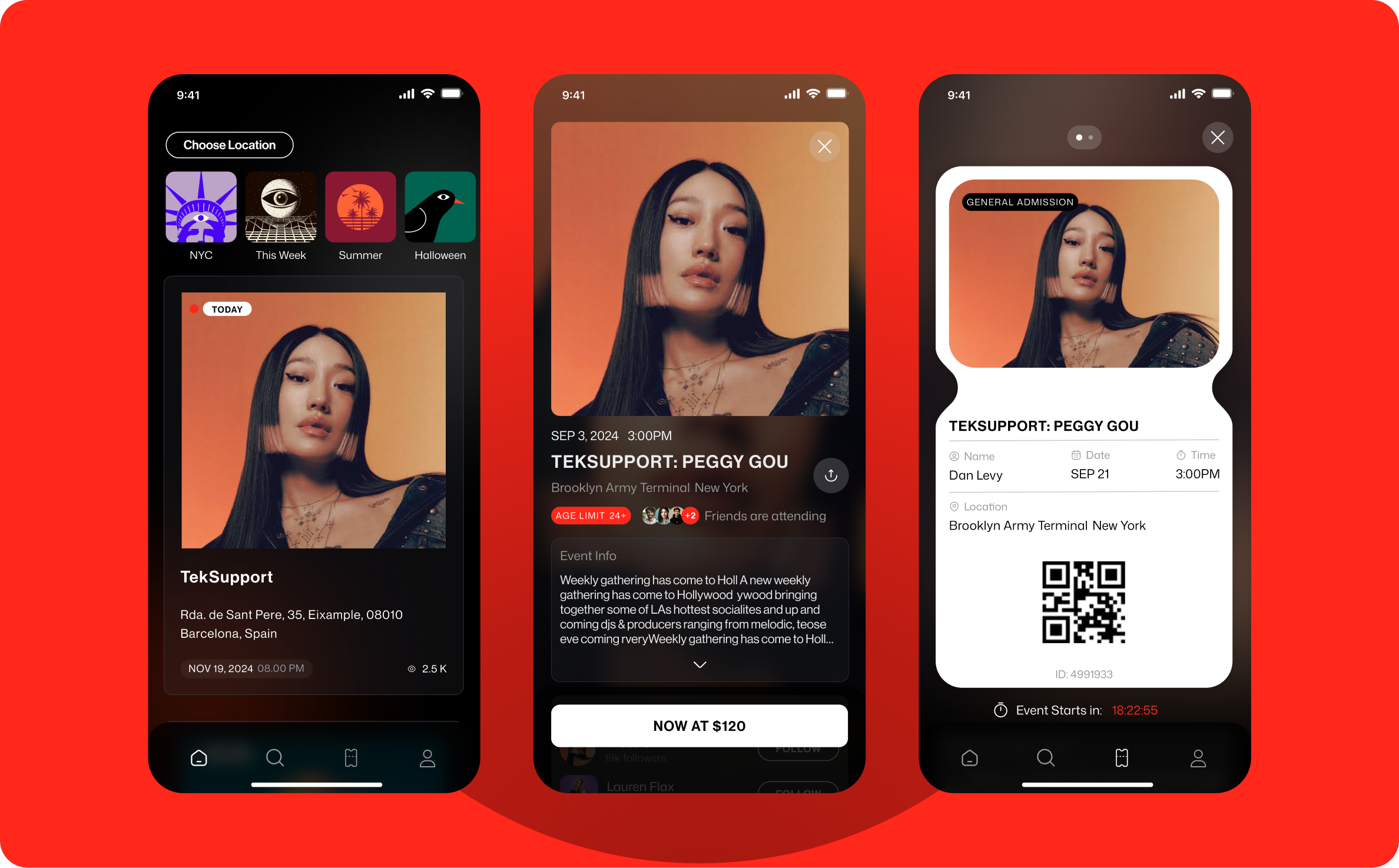
Getin
Getin is a mobile platform for discovering live events and purchasing and managing tickets, with a focus on nightlife, concerts, and festivals.
I worked as the lead designer on the consumer app, collaborating directly with the CEO and CTO across the end-to-end experience - from onboarding and event discovery to checkout, ticket management, and entry.
The product journey
Buying a ticket is only one moment in a much longer journey.
Users discover events, explore artists, compare ticket options, make a purchase, manage their tickets, and eventually need to access them quickly at the venue.
When I joined the project, Getin was moving beyond its existing web-based experience. Feedback showed friction across different parts of the journey - event information was not always clear enough, and in some cases users had trouble accessing their tickets when arriving at an event.
The goal was to rethink the experience as a mobile product built around the full lifecycle of attending an event.
Discover → Explore → Purchase → Manage → Attend
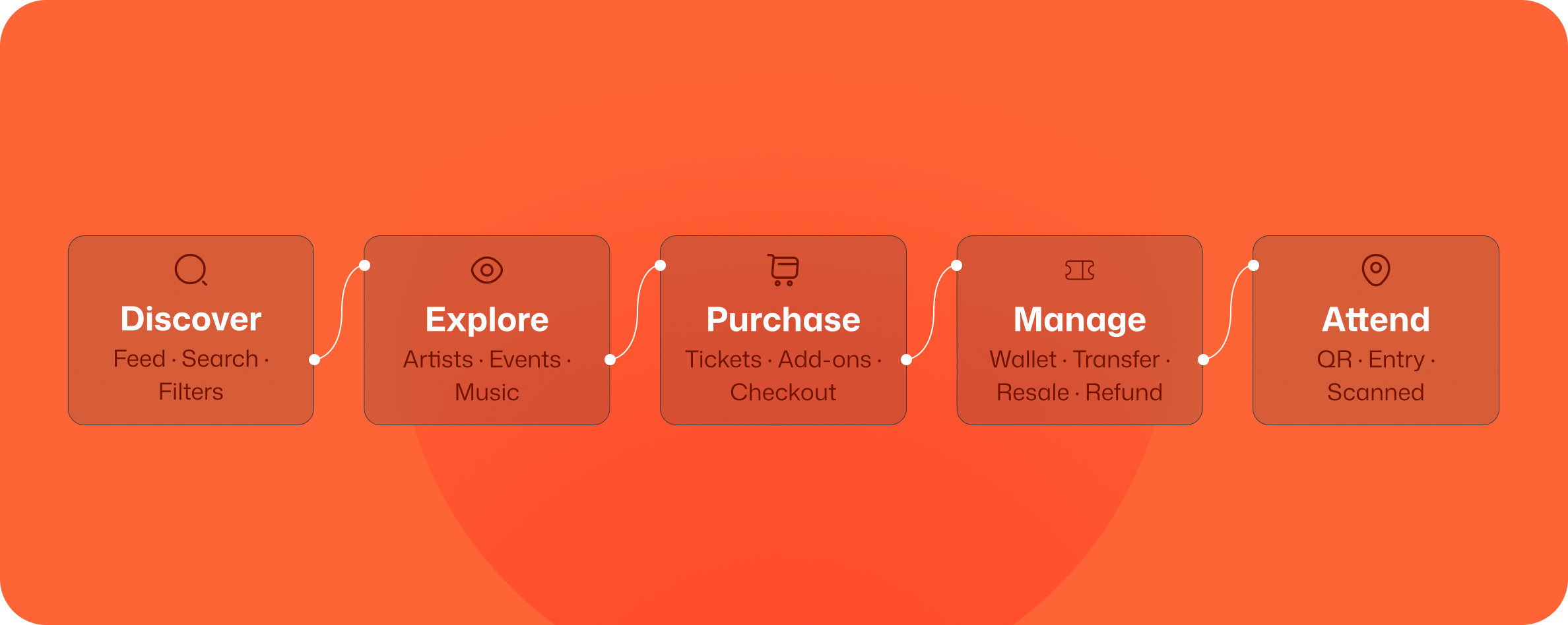
Research and product mapping
Before designing individual screens, we mapped the main areas of the product and worked through them progressively.
The process combined product requirements from the leadership team, recurring issues from the existing experience, competitive research, and ongoing design discussions with the CEO and CTO.
Products such as DICE were particularly useful references because of their focus on similar types of events, alongside platforms such as Shotgun and SeatGeek.
The objective was not to reproduce an existing ticketing pattern, but to understand the conventions users already recognized and decide where Getin needed a different approach.
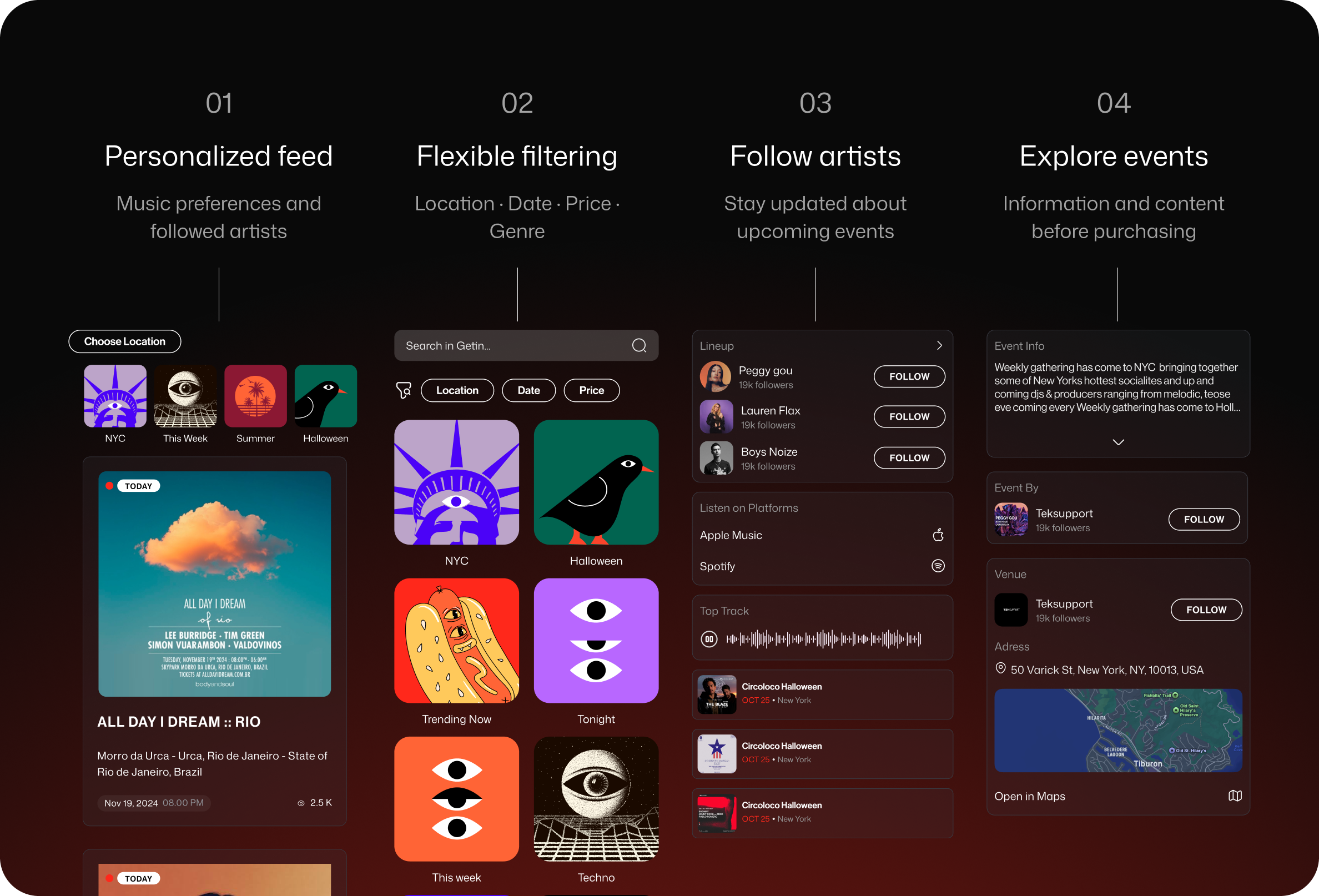
Event discovery and personalization
Event discovery was an important part of the experience.
Instead of treating the home feed as a generic catalogue, Getin could connect with a user's Spotify or Apple Music account and use their music preferences to make discovery more relevant.
Users could also follow artists, stay updated about upcoming shows, search freely, and filter events by location, date, price, and genre.
This created several paths into the same ecosystem:
Music taste → Artists → Events
Search → Event
Filters → Event
Feed → Event
The goal was to make browsing useful even before users knew exactly what they wanted to attend.
Event pages
An event page needed to answer the practical questions - where, when, and how much - while also communicating what the experience would actually feel like.
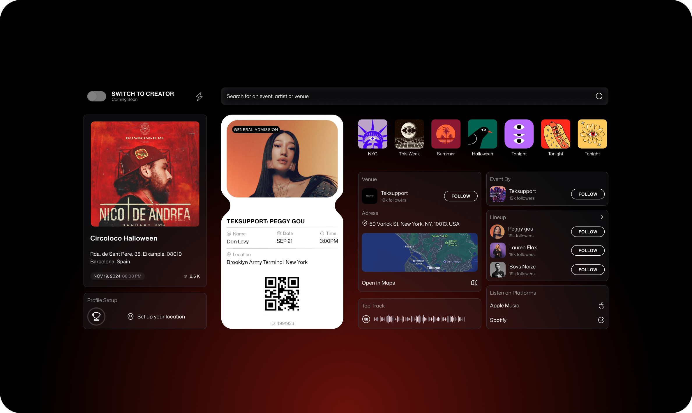
Depending on the event, pages could combine location and map information, dates and times, ticket availability, related events, artist information, live performance content, and music playback.
For artist-led events, users could listen to a featured track and continue directly to Spotify or Apple Music.
Event pages brought together the information users needed before purchasing: date, time, location, ticket availability, artist content, and related events.
Ticket purchase and checkout
On the surface, buying a ticket is a straightforward flow:
Choose event → Select tickets → Add extras → Pay → Receive ticket
The underlying system was considerably more complex.
A single event could contain multiple ticket types and price tiers, each with different availability or sale windows. Purchases could also include promotional codes, service fees, parking, drink vouchers, merchandise, and product variants such as clothing sizes.
Some merchandise was purchased digitally but collected physically at the venue.
The challenge was to support these variations without making every purchase feel complex.
I kept the main journey sequential, introducing options and additional information only when they became relevant to the current purchase.
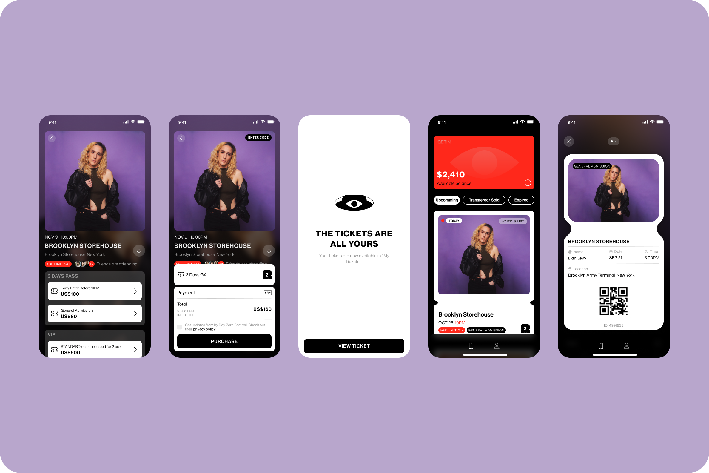
Designing the ticket lifecycle
The ticket became one of the most important components in the product.
After purchase, it needed to work as more than a QR code. It was the user's interface for managing their relationship with the event.
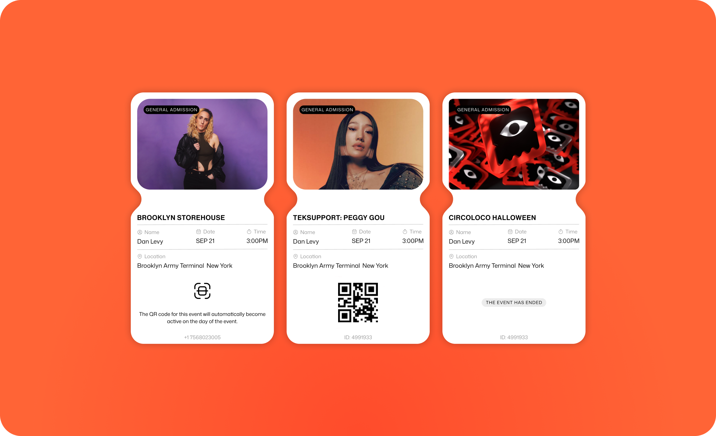
A ticket could be:
Available · QR hidden · Scanned · Waitlisted · Waitlist cancelled · Transfer pending · Transferred · Partial refund · Full refund · Resale pending · Sold · Event ended
Each state could change both the information users needed and the actions available to them.
The design challenge was to support all of these scenarios while keeping the ticket immediately recognizable.
Prioritizing ticket actions
As more functionality was added to the ticket, showing every possible action at once quickly became impractical.
Instead, actions were prioritized according to the ticket's current state.
The most relevant actions — generally up to three — remained directly accessible from the ticket, while less important or less frequent actions moved into a secondary menu.
This allowed the same component to support transfers, resale, refunds and other functionality without turning every ticket into a dense control panel.
The interface changed with the ticket's state while the underlying structure remained familiar.
Ticket iterations
The ticket went through several design iterations.
It needed to accommodate different screen sizes, iOS and Android environments, changing content lengths, QR-code requirements, different event types, and a growing number of ticket states and actions.
Rather than creating a separate design for every scenario, I worked toward a flexible component that could adapt while preserving the same hierarchy.
Event identity remained prominent at the top.
Essential ticket information stayed easy to scan.
The QR area maintained a predictable position when available.
Actions changed according to context without changing the overall mental model of the ticket.
This made the component capable of growing with the product instead of being redesigned every time a new ticket behavior was introduced.
Designing the journey as a system
Working across the complete consumer application meant many of these decisions could not be made in isolation.
Onboarding, authentication, discovery, search, artists, events, checkout, profile, wallet, and tickets all needed to feel like parts of the same product.
Alongside the individual flows, I refreshed the design system and established reusable patterns that could accommodate the different states and interactions appearing throughout the application.
The work gradually became less about designing individual screens and more about creating a system capable of supporting the full event journey.
Outcome
The project evolved Getin's consumer experience into a mobile product designed around the complete lifecycle of attending an event.
Users could move from discovering an artist or event, through a purchase containing different ticket types and extras, to managing the resulting ticket and eventually using it at the venue.
For me, the project was an exercise in balancing two very different qualities: making a consumer product feel immediate and simple while designing for the many states, rules, and edge cases operating underneath it.